Your 2025 Spring Color Palette is Here
Last updated on March 31st, 2025
Spring is all about renewal, and what better way to refresh your home than with colors that capture the essence of the season? Maybe you want to brighten up a room with fresh hues and soft pastels. Or perhaps warm and earthy tones are more your speed. Whatever your personal style, our curated palettes are here to inspire you for spring and beyond.
Interior designers and trend forecasters have made one thing clear: color is in. Though neutrals will still have a place, more people are ditching all-grey everything in favor of hues that feel energetic, expressive, or even nostalgic. Here are some of the top colors expected to define interiors for spring 2025 and beyond:
Fresh & Vibrant colors
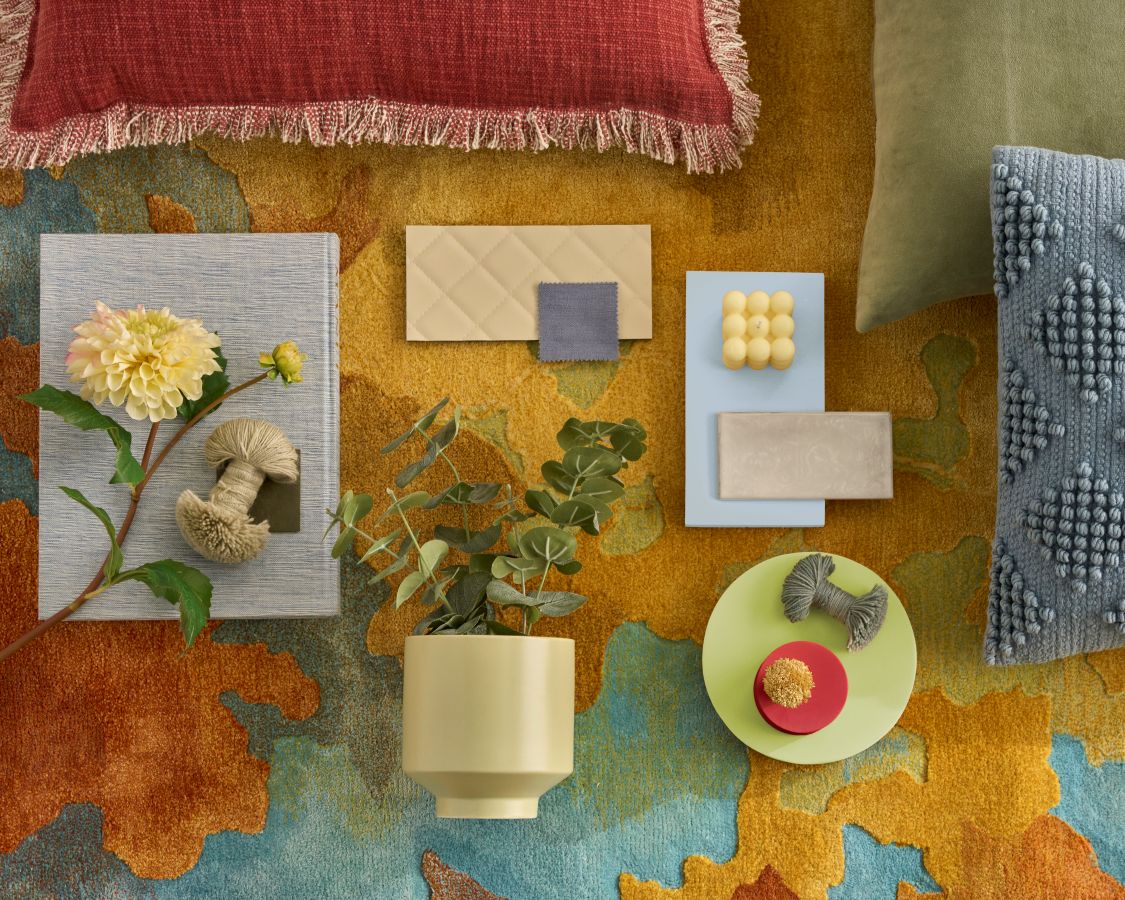
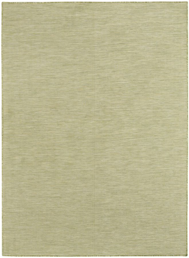
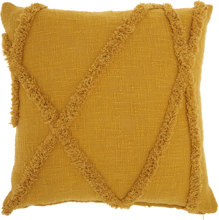
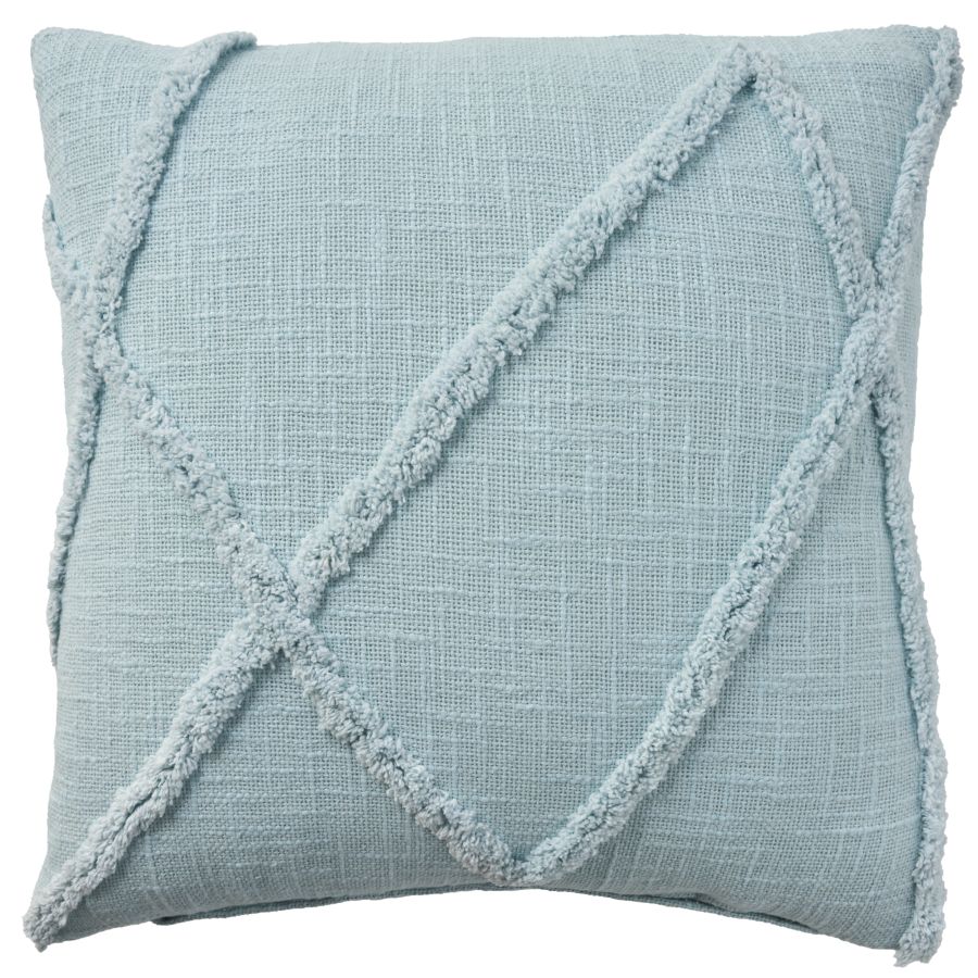
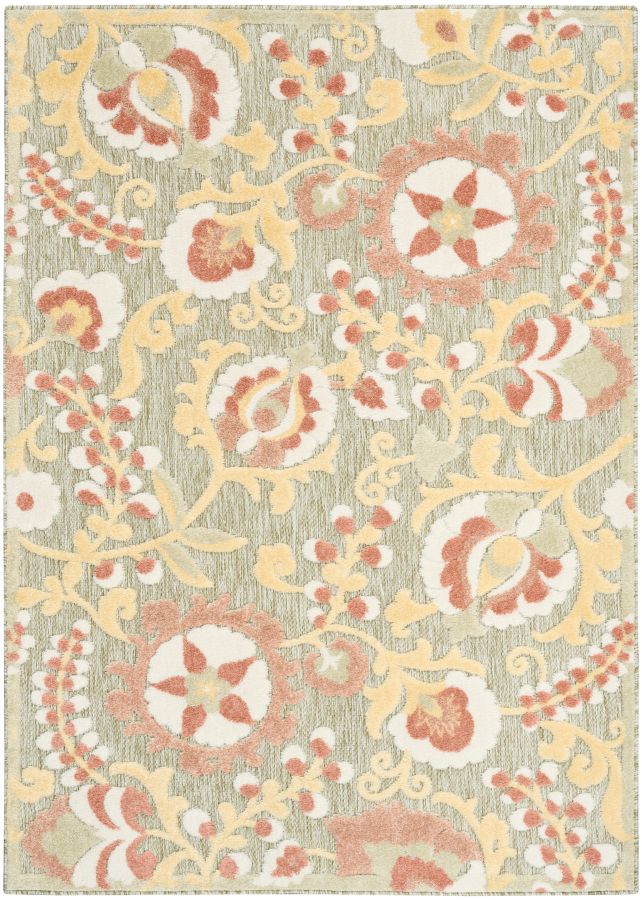
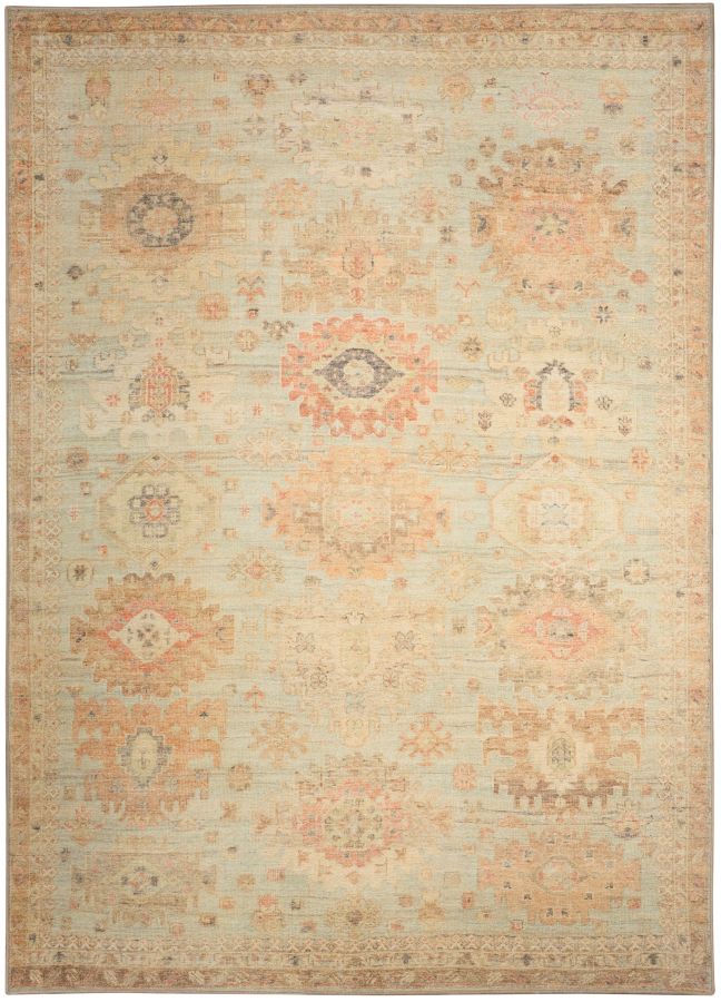
This energetic palette reflects the movement away from “cookie-cutter” looks and into styles that inject personality. From creamy greens to rich yellows, these colors bring a sense of renewal perfect for the season.

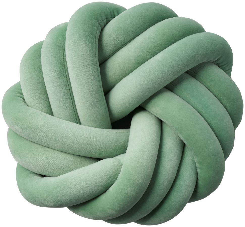
Matcha Green: This soft green is inspired by nature and brings the tranquil feel of the outdoors into any space. It works beautifully in a wellness nook or a room where you want to create a restorative atmosphere. Pair with warm neutrals or deep earthy tones for a touch of contrast.

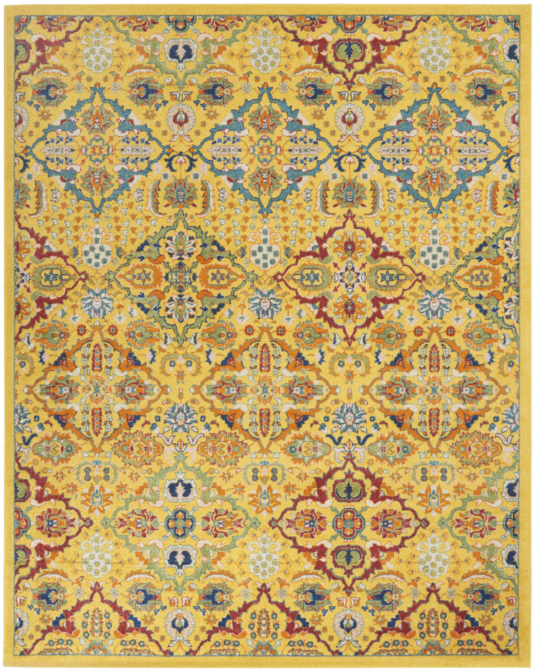
Goldenrod: A rich, golden yellow that brings vibrancy and warmth to a space. Variations of this color are popping up in everything from furniture to kitchen décor.

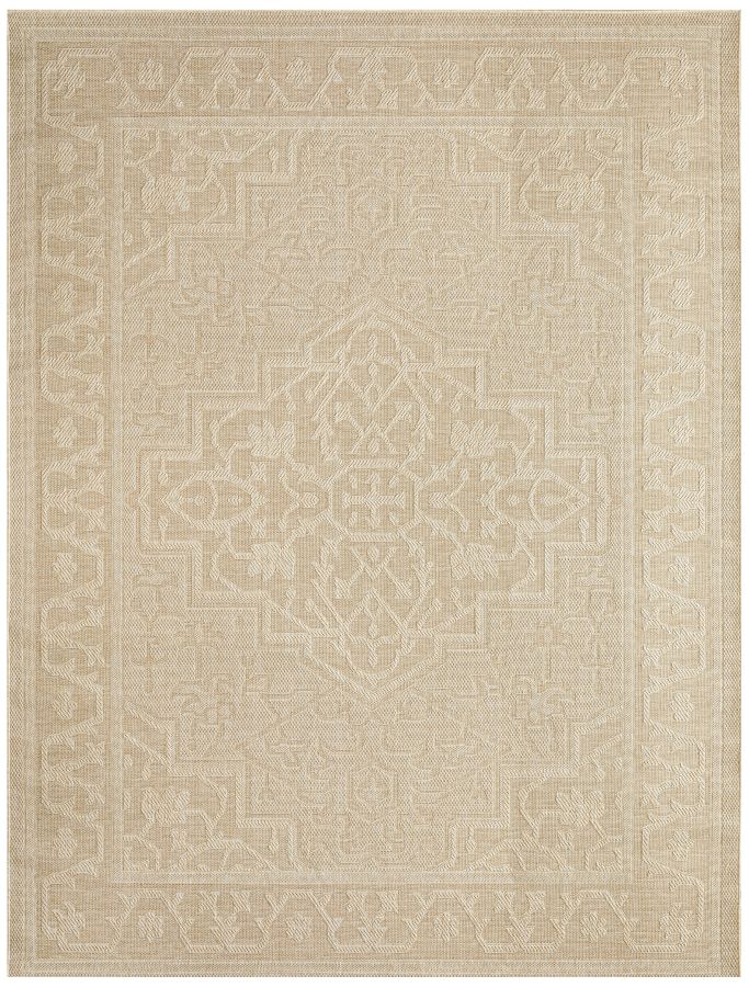
Honeyed Beige: This fresh take on traditional beige has warmer undertones that add depth. For those who love neutrals, this shade adds just enough richness while maintaining versatility.

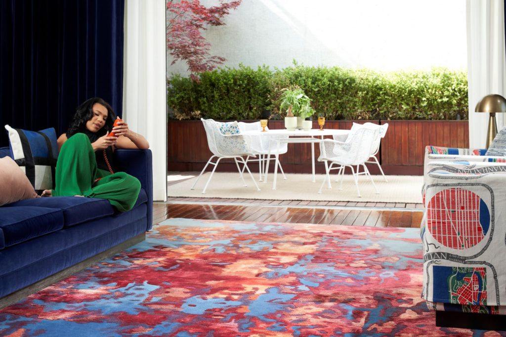
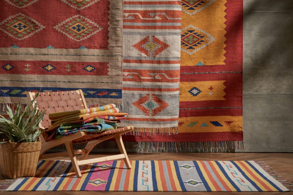
Flame Red: The “unexpected red theory” that took root in 2024 sees more homes using anywhere from softer vintage reds to rich hues like cherry red. This red variation adds a vibrant touch that doesn’t feel overwhelming.

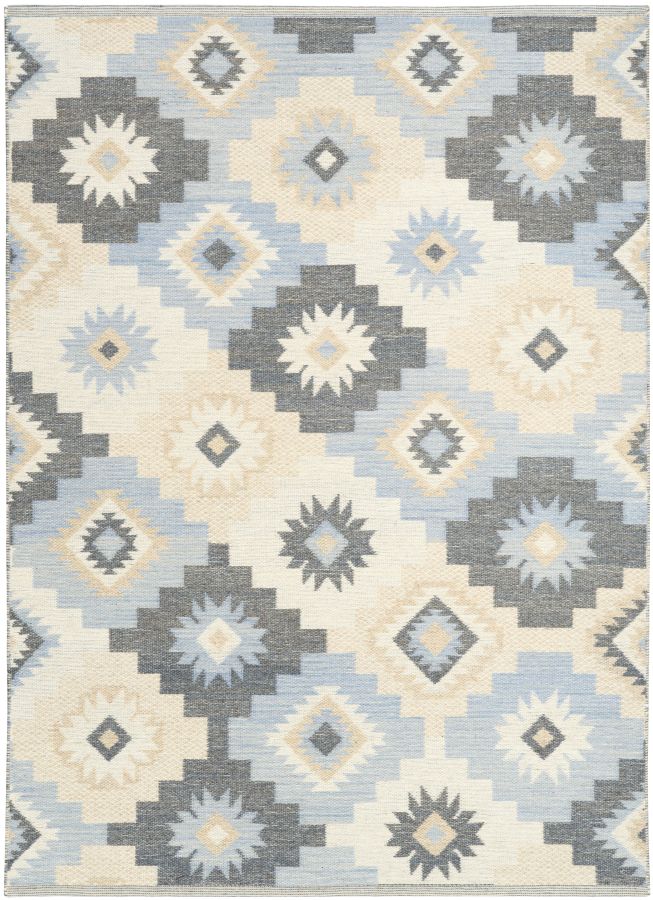
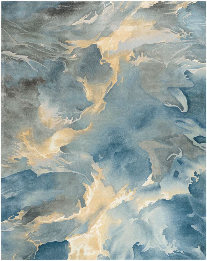
Icy Blue: A cool, crisp blue that brings an airy feel to any space. This shade is great in small rooms as a way to make them feel light and open.
Shop Fresh & Vibrant rugs and accessories:
Playful Pastels
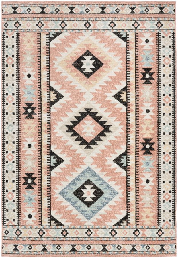
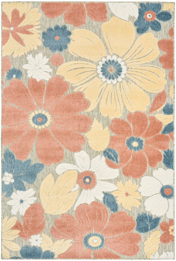
While pastels have never fully fallen out of favor, this year’s return is fueled by the broader nostalgia movement. Colors that were everywhere in the 70s and 80s are being reimagined in modern ways. Our 2025 picks make a statement while keeping a light and whimsical feel.

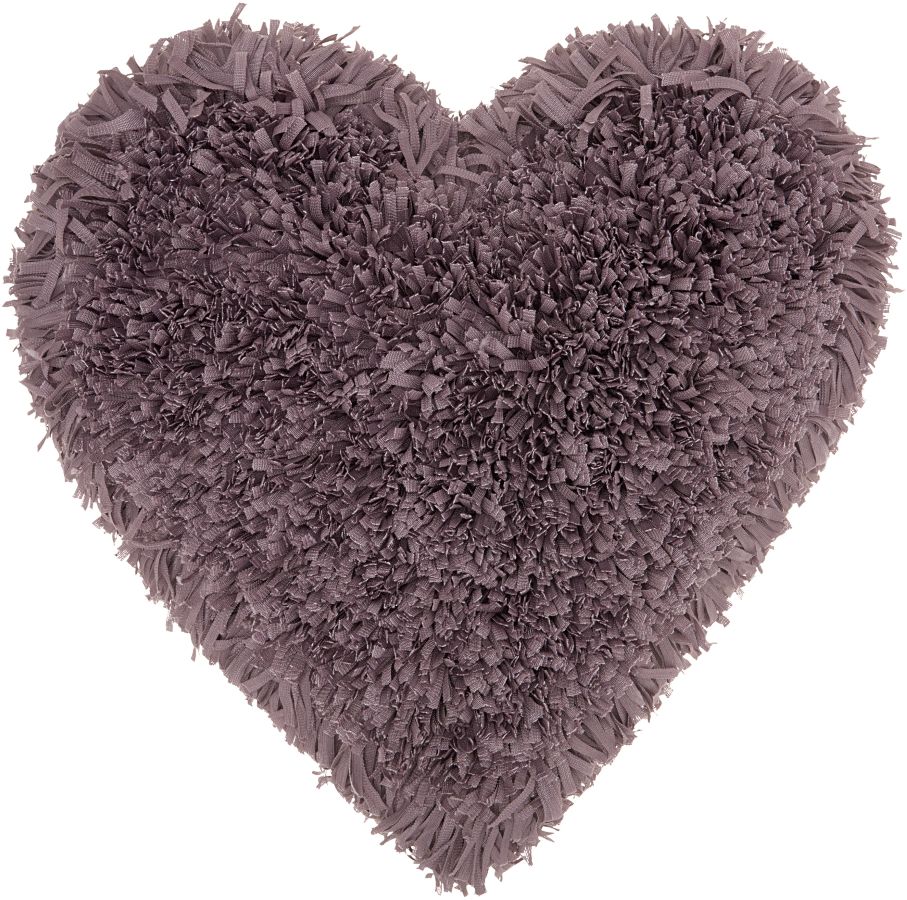
Lavender: This dreamy purple is surprisingly versatile. You can easily pair it with creamy neutrals, darker jewel tones, and even some earthy hues.

Peach: This warm, easygoing shade is a great alternative to pink that still gives off soft vibes.

Mint: A refreshing green with cool undertones that’s great in both open concept spaces and small rooms.

Coral: A bright and playful blend of pink and orange that brings uplifting energy to any space.

Buttercup Yellow: This creamy yellow has a soft, sunlit feel. Variations of the color are popping up everywhere from the runway to the living room.
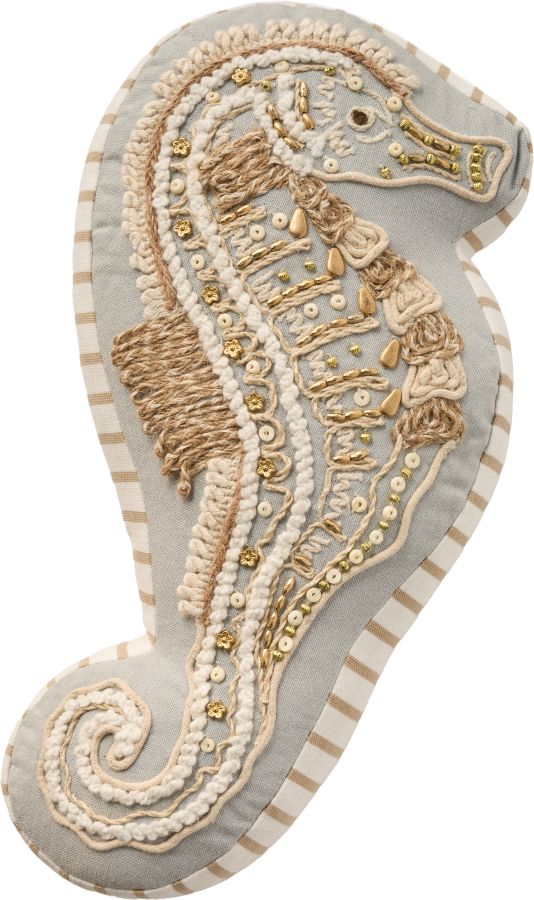
Shop Playful Pastel rugs and accessories:
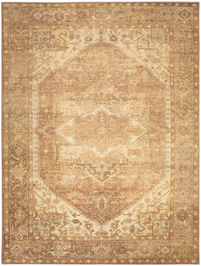
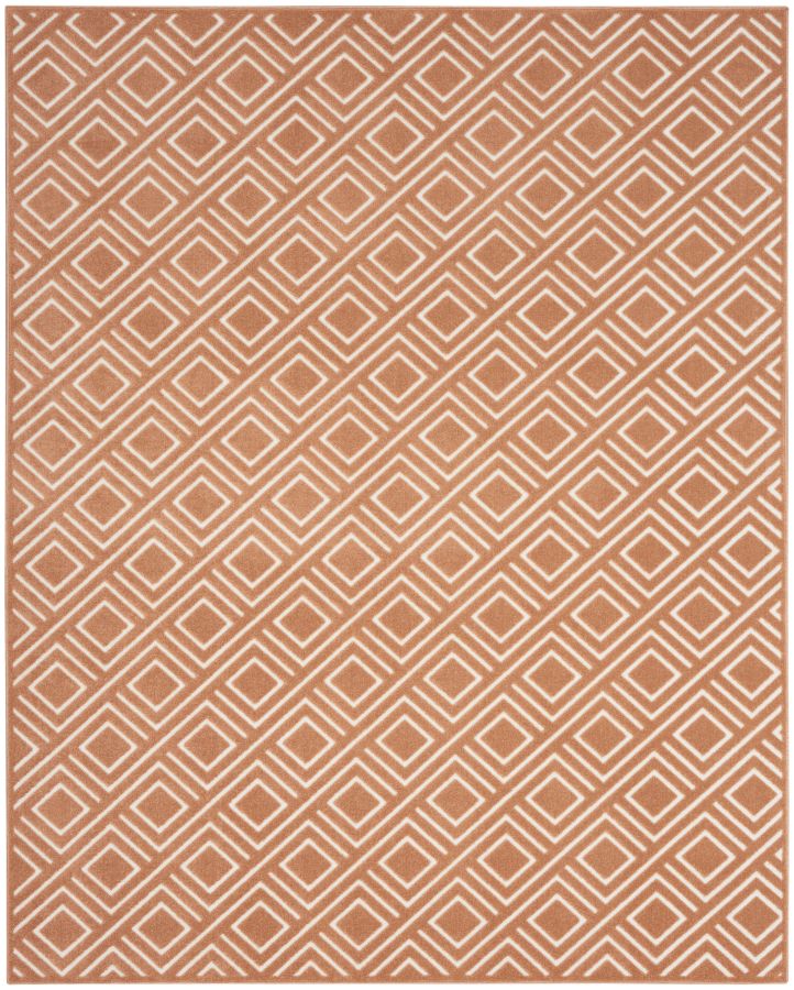
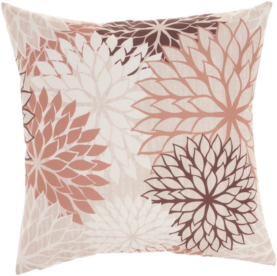
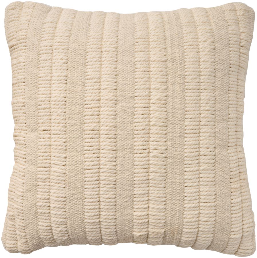
Warm & Earthy colors
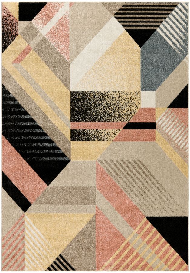
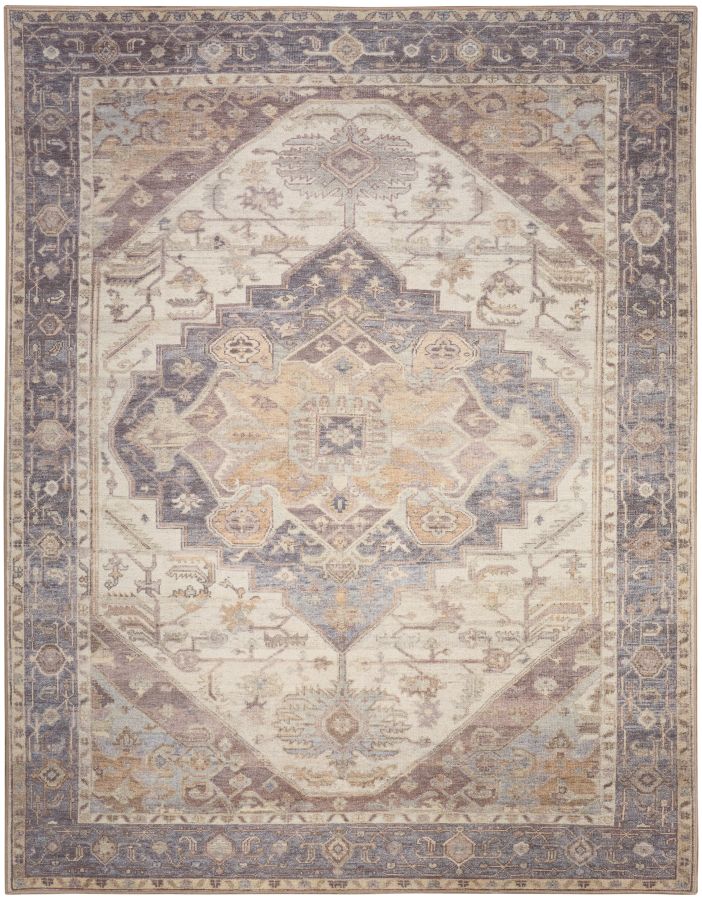
Closing out the 2025 color trends are warm neutrals and earth tones. This palette takes a cozier spin on classic neutrals with a focus on hues inspired by natural materials. These colors are perfect for anyone who wants to create a lived-in feel.

Aubergine: This deep, moody purple adds depth and sophistication. Perfect for creating a dramatic contrast.

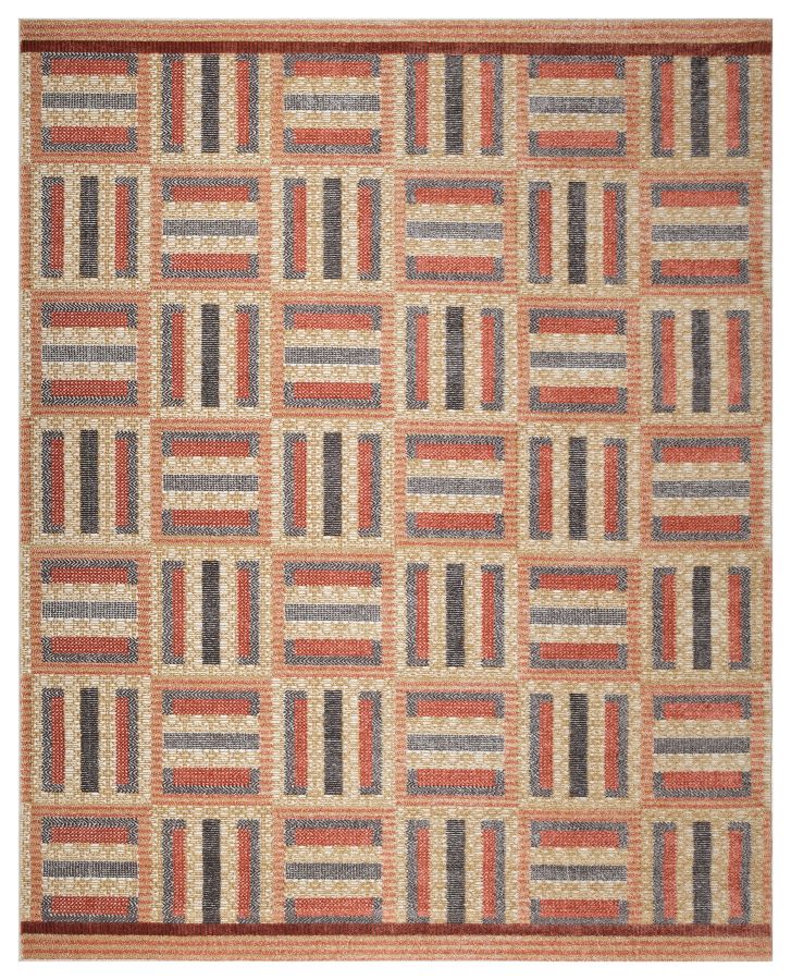
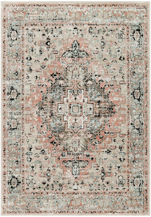
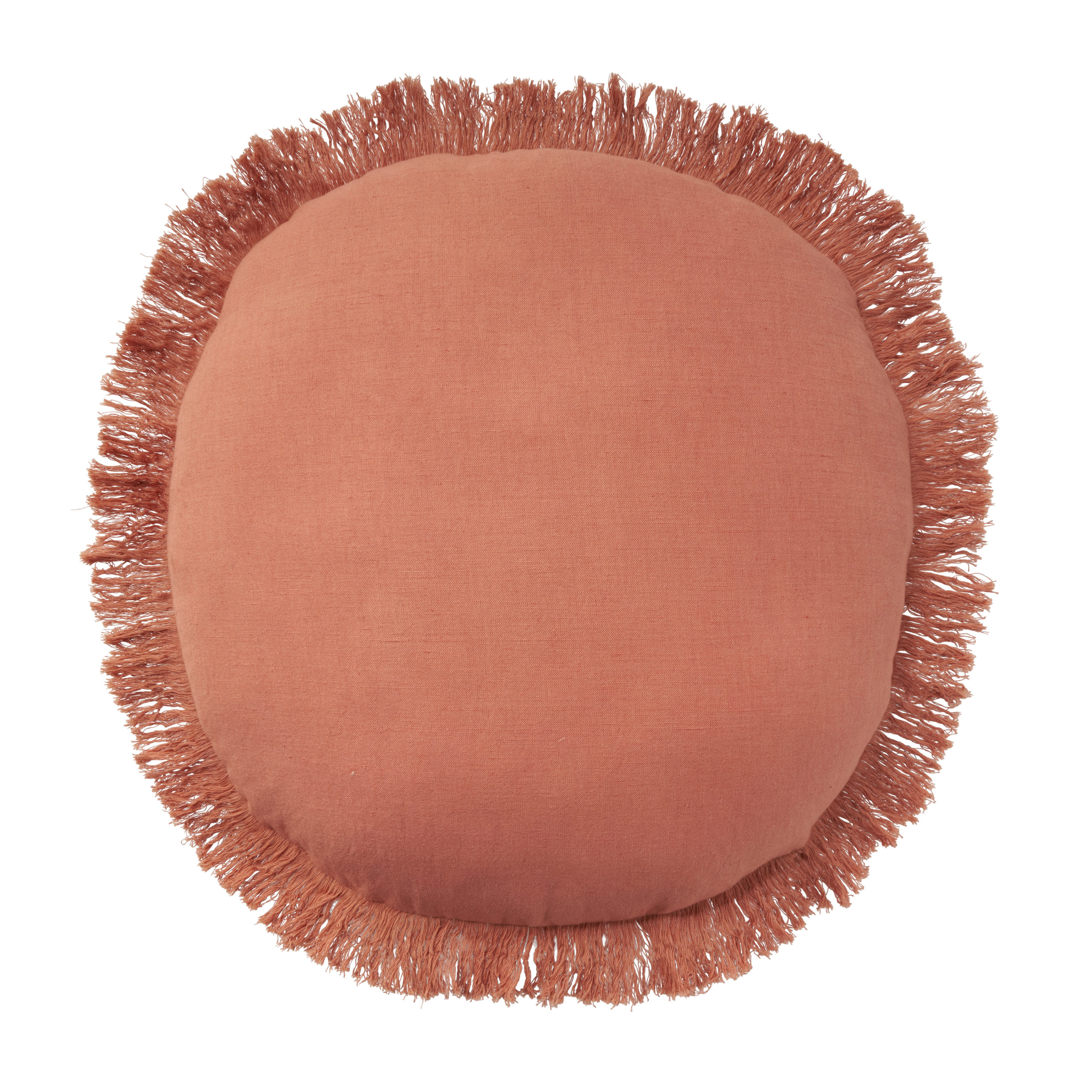
Baked Clay: Think terracotta, but softer. This shade brings a feeling of sunbaked warmth that works well in rustic and modern spaces alike.

Camel: Classic and comforting, this gold-toned neutral is a staple in contemporary decorating.

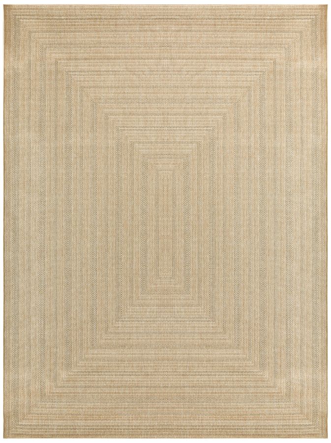
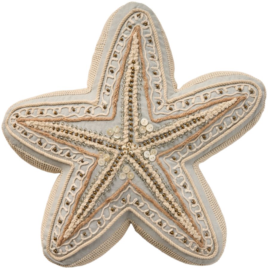
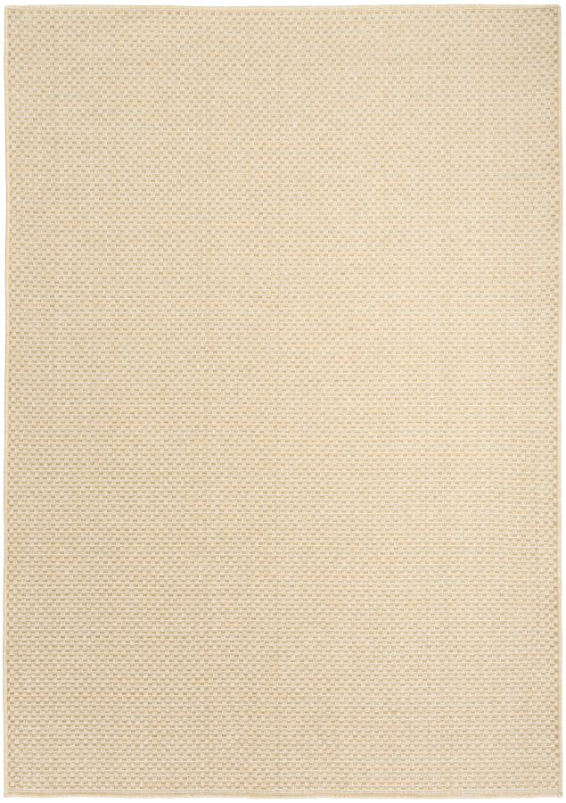
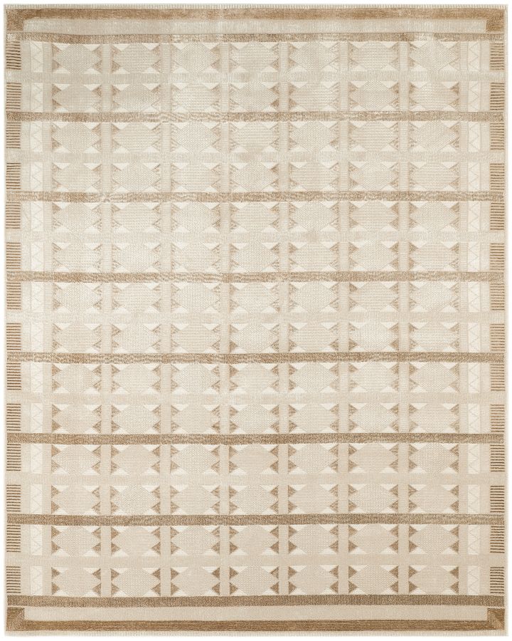
Toffee Cream: A creamy beige with warm undertones that bring an inviting energy. This tone is light enough to add just enough warmth without overpowering the room.

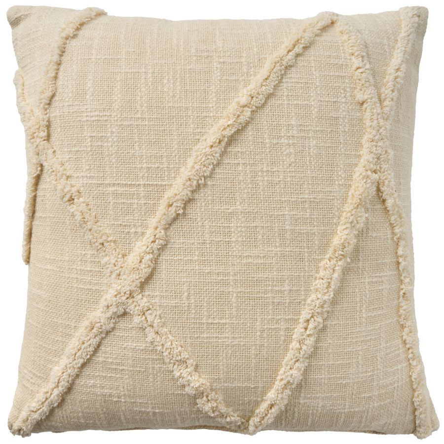
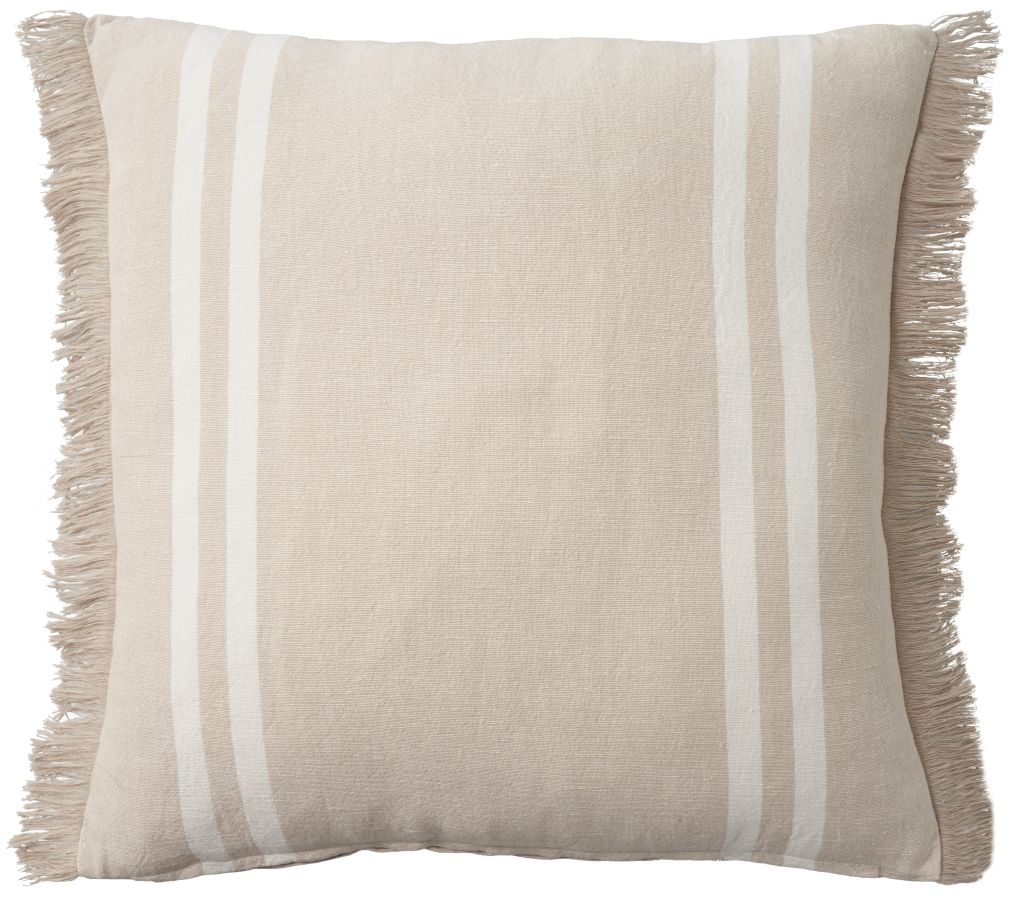
Light Sand: The perfect off-white that keeps everything balanced while adding just a hint of warmth. Use this as a base color to let bolder accents shine.
Shop Warm & Earthy rugs and accessories:
How to use these colors at home
Start small. If you’re not ready to repaint a whole room or invest in new furniture, try pillows, rugs, or other small accents in your favorite spring shades instead.
Mix warm and cool tones. Pairing warm and cool shades, like mint and baked clay, adds depth and contrast to a space. The key is balance: color combinations like this add vibrancy without feeling overpowering.
Layer neutrals with pops of color. If you like bolder colors like flame red and coral but worry about overwhelming your space, use them as accents instead. Neutrals like honeyed beige or light sand are great for layering with bright colors.
This season is the perfect time to refresh your space with colors that make you feel energized, inspired, and at home. Whether you lean toward soft pastels or vibrant hues, the 2025 spring color palette is packed with colors that you can use any time.
Which color are you most excited to try? Share this post, pin it for later, and follow us on social to let us know your favorite spring shades!
